Sunday, September 30, 2012

Vintage frames wall decor

My daughter is obsessed with textures and everything vintage. Her bedroom wall was looking a little plain, so we bought a mix of different vintage-looking frames and lined the insides with simple scrapbooking paper. 


The key to pulling off this look is using a variety of polished and raw woods, high gloss metals, and both shiny and flat ceramic frames. Also, keep the same theme inside the frames by choosing paper with different textures, like burlap, cork, brick, and jean fabric. The different mediums really keep the eclectic vibe together.

Tuesday, September 25, 2012

Spain Travel Scrapbook Pages: Barcelona

Scrapbooking has been one of my biggest passions, one that I have been endulging in for years. It all started more than ten years ago when my sister was given a scrapbook magazine, along with an album for her baby shower and instantly I was hooked. For years I completed several albums for my special moments and milestones.  But mainly I have gravitated more towards focusing on creating travel pages for my vacation pictures.

As soon as I plan a vacation to a new and exciting spot, my mind starts to wonder what beautiful pages I would be able to create on my return.

Here are some of my favorite pages from a recent trip to Barcelona, Spain:


While visiting a city I like to include the history and culture of the place. That inspired me in the creation of the following page:


 In this page I used a lot of distress inks to create the old world look:


Page dedicated to Casa Batllo one of Barcelona's most famous landmarks. Once again I used stamping and distress inks to aged the papers.


One of Spain's most famous Architects,  his work is found all through the city.


And this one to Barcelona's Royal Palace. Some pictures are blocked with black to maintain privacy.


This page is all about the food!


This is a page made for my visit to one of Barcelona's most famous markets "La Boqueria". Using background paper with fruits to match the theme of the page.


Thanks for reading and I'm always happy to get your comments.


Sunday, September 23, 2012

Art Store visit

This week for the first time I accompanied my daughter to her art supply store. I was amazed at how many ideas and inspirations came to mind just from looking at their fabulous displays.

I'm more of a crafter/scrapbooker/sewing person, she is more into painting and computer design. But this trip made me realize all artists have something in common: We like beautiful and inspirational displays. Here are some of my favorites:


love all the boxes in this display.


The most fabulous collection of paper:


These are mannequins with dresses made out of paper. So original!


I was awed with their collection of  markers.


And other supplies.


I was very pleased to find the most incredible Tim Holtz scrapbooking supplies collection, which happens to be one of my favorites.


Even the outside of the store caught my eye, with this marvelous art display:


Thanks for reading and your comments!

Saturday, September 22, 2012

Create your own personalized journal

Journals are the perfect companion to keep us all organized. For years I have been looking for the perfect journal and it was quite the impossible task. As a scrapbooker for years I have lots of leftover paper scraps and decided to put them to good use.


I got inspired by this pretty paper and stickers by K&Company, one of my favorite scrapbooking supply brands.


Then I proceeded to create dividers with my own personal interest in color coordinated paper, using stickers and other embellishments for each section.


With the help of my Cricut, I made tabbed labels and titles to decorate my pages.


Each section is unique but still follows the same coordinated design.


I also included some of the same decor in inside pockets and dividers.


Inside, all my creative ideas and inspirational pictures found a home.


For the cover I used the same inspiration paper and decided to use my monogrammed initial. And voila here is my own personalized journal.


Thanks for reading and don't forget to comment.


Friday, September 21, 2012

Artsy work station

My daughter was running out of space to store all of her art supplies, so we decided to add some shelving above her desk. Now her paints, brushes, canvases, pastels, and chalks have an organized section that also doubles as decor. We decided to go for a raw wood and iron look. The industrial look didn't make us scared to spill a little paint on it.


Here's a close-up of the first shelf. We got a vintage tea set in a thrift store to hold all her brushes. And an old mail filer became a home for her paints. The frames I got from Ikea, they're old pastels and brushes, perfect for the theme.


For the second shelf, we wanted to make all the chalks, pastels, and paints look uniform. They all came from different stores and brands. So I cut open the center of each box for more display area, and spray painted the boxes a glossy black. It really made the colors of each medium pop more.


Here's one of the original boxes for her watercolors, and the spray paint process.

And we also picked up an awesome ceramic owl from Target to house her organic wood color pencils.


Thanks for reading and for your comments.

Thursday, September 20, 2012

Filing cabinet makeover

I found this filing cabinet in a thrift store this week, for just 10 dollars. It was in pretty bad condition, but all it needed was a little TLC.


As you can see, the top layer was rusted pretty badly. 


After sanding it down until the top was smooth, this is what it became.


To get rid of the uneven discoloration, I used a coat of Rust-o-leum spray paint, in a glossy white. The Rust-o-leum also helps prevent further rusting. It definitely transformed the cabinet.


But then I decided that I hated the handles on the cabinet. So I drilled holes above the old handles, seen in the picture above. I got handles at Lowe's for $2, and spray painted them gold. Later I changed my mind and ended up choosing the white for a more uniform look. 


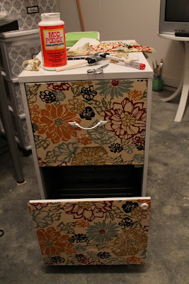
The cabinet still looked a little plain though. So I decoupaged fabric onto the front portion to make him more "fabulous". Just a third of a yard did the trick, and it cost only $2.


Here's the finished product, perfect for storing all your crafting supplies!


Thursday, September 6, 2012

Trip to my favorite store: Ikea


I can't get enough of Ikea. Every trip brings a new idea to incorporate in my home and especially into my craft room. Yes, I'm still in the renovation process of my craft room, and its taking me quite longer than expected. While in the store some great ideas came to mind.


This can be a great storage solution for all your sewing needs:


Remember to keep your mind open for different styles and color options.


I fell in love with this white desk:


Don't be afraid of visiting the children's department, where there are some great and affordable storage solutions.


For those finishing touches and pops of color pick up some accessories to match your decor like these chairs and wastebaskets (only $1.99).


And finally, don't forget to visit the as-is department. It has great discounts on lightly used floor models, like these chairs I purchased for $15 each  at a 40% discount.  They will be a wonderful addition to my craft room.


Thanks for reading and I'm always happy to get your comments